Accessible Font Contrast Part 2
It's all about the Patches
Themes, SASS and Transpilation
SASS is a DSL that transpiles into CSS. (DSLs really are everywhere.) In this case there is a variable $theme and an rgba function that come together to transpile into a button_translucent css class. This class uses the $theme as the foreground color (font color) and an alpha translucent variant of the $theme as the background color for the non-accessible tag links.
I'm not going to go too deep into understand what SASS does at this point, but you can infer the final transpiled class name from the _components.sass file. Beneath the .button definition we find the the &_translucent definition. That will be transpiled into the button_translucent css class.
Back to the problem
In this case it will be difficult to get enough color contrast by using the same color, except translucent. If we push the background color to be transparent enough, the entire button will loose contrast with the page background. There doesn't seem to be a way I can get the result that I want from this approach.
There are a few examples like this, where people have created functions to calculate an color that has enough contrast, but I want to keep this simple. Instead I'm going to see if I can keep this simple. Something I often do is look for the brut-force approach first. I want to understand what I'm really working with before I get fancy.
A Fix
Starting with this contrast pallette tool I find a few options using the following params. Font Size 12.5px Background color $theme (#0077b8). I also decided I wanted to up the font-weight. It was a little thin for my eyes, so I upped it to 900. Given those inputs, not many options were available. I opted to go with #e0ffff as it was still a little in the blue range. I am not a designer, and I should never have any meaningful control over a color pallette, but in this case I needed something that would pass an accessibility scan, so we had a winner.
To get this to work I had to update the &_translucent definition to the following & we got close
1&_translucent
2    background-color: $theme
3    color: #e0ffff
4    font-weight: 900
5    border: 1px solid transparent

There was one last thing. I wanted to have the "counts" on the tags have a distinct background. I had to update the &_tally definition to
1&_tally
2    padding: 0 0.75rem
3    border-radius: 0.5rem
4    background-color: #064b70

New Score & New Problems
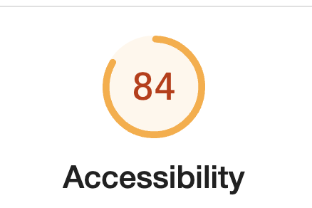
So for the homepage, we're looking a little better. However as soon as I run Lighthouse in dev tools on any other page, a whole new set of problems arise. The good news, I have more work I can do. The other good news, I made progress & I learned a little bit more of around how Hugo & SASS work. I've gone with the override vs Fork flow so everything I've mangled can be seen in Github.

QOTD
“You can observe a lot just by watching.” ― Yogi Berra