Accessible Font Contrast Part 1
Technicolor High-Contrast
First the Why
It's fair to assume that this set of blogs won't get much traffic. Sure I'll dink around with things like SEO, or cross posting on Linkedin, but there's too much content for this to get any eyeballs. So for me this goes back to an incident in pre-school.
It was my first day in Challenger Preschool. Many long years ago. After a morning of being read to, experiencing the recess with lots of loud kids, it was time for Art. We were going to make Paper Bag Puppets. A brown paper bag, some crayons, glue and scissors, it was going to be great. And I kicked some butt. I was the first kid done with their puppet.
But something was wrong. When I let the teacher know I was done, suddenly she was talking to another adult, and before I knew what was happening I was being led into another classroom with even more kids. I was told to sit at a table, and color.
I was mad, scared, ashamed, confused, really worried... I had no idea why I was in a new room. Either I couldn't understand what the teacher was telling me, or they weren't taking the time to explain what was happening in a way I could grasp. Things were happening to me, and I couldn't understand.
When I was picked up later that day, I heard the teachers explain to my mom, that I was too advanced for the first class (what ever that meant). But what stuck with me about the experience was that when you intentionally, or unintentionally keep information from people, it can be extemely frustrating.
While my experiences are not the same as those with differing abilities, I really want to see if I can start with empathy, and find a way to include as many as possible in whatever I'm trying to get after.
Okay, What's First

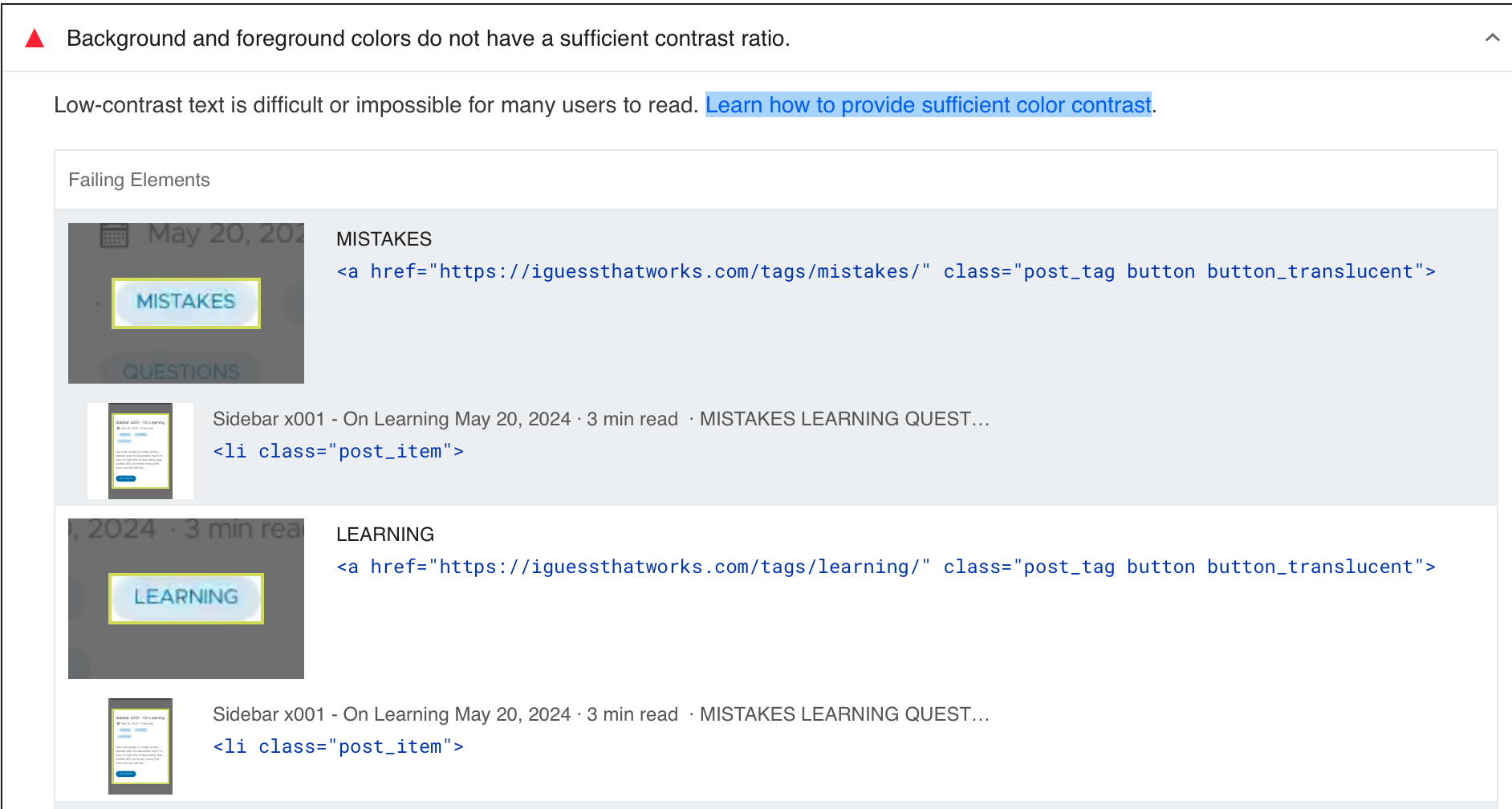
I'm going to see if I can fix the contrast between the Tag text and the tag background. I'll start by trying to update the color from #0077b8 to #c5f55c and see if that helps with contrast.
FAIL!!!

Okay, lets see if I can figure out what the SASS is going on.
- I updated the
$theme: #0077b8value in an assets/sass/_variables.sass to$theme: #c5f55c- and it changed the color of the font, but the background is updated as well.. hmm - If I find the html
<a href="http://localhost:1313/tags/dsl/" class="post_tag button button_translucent" title="dsl">that renders those links, I see that there's a button_translucent class that comes from here. I see thebackground-color: rgba($theme, 0.15)call. Maybe what I need is to increase that contrast with the original colors
Better?

But, it doesn't have a Color Contrast Ratio (CCR) of 4.5:1. The WebAIM calculator doesn't quite know what to to with these colors, but even just an quick glance would tell me I'm off. Not to mention I haven't even looked at the Dark Mode contrasts. I'll need to spend a little time thinking about this one. First reading a bit more about color contrast and then, since I only loosely understand SASS, I'll need to spend a bit of time walking that tree
QOTD
“When you change the way you look at things, the things you look at change.” ― Max Planck